![Vu[e9] Components](https://htmlsigs.s3.amazonaws.com/logos/files/001/087/329/landscape/e9ineLogo.png)
# Components
# Avatar
The Avatar component creates a scalable element that can have text, image or gravatar within a circular, rounded or square shape. It's width and height can be altered by using the size property. Below is a full list of the customisable properties:
Properties
| Property | Type | Default | Required | Description |
|---|---|---|---|---|
| size | Number | 160px | Size of each avatar in pixels. | |
| text | String | John Doe | Avatar Text. | |
| gravatar-email | String | If you would like to render the gravatar image, please supply the email here. More details can be found at https://en.gravatar.com/. | ||
| image-url | String | Image Url for the Avatar. If not available the text initials will be used. | ||
| variant | String | rounded | Avatar variant. Possible values are square and rounded. |
# Avatar Group
Easily group avatars of any size, shape and content with the Avatar Group component. The component accepts an array of Avatar objects.
Properties
| Property | Type | Default | Required | Description |
|---|---|---|---|---|
| avatars | Array | Array of Avatar objects. Refer Avatar component for the available options. | ||
| avatar-size | Number | 48px | Size of each avatar in pixels. If size is not provided, it takes 48px as the default size. | |
| max | Number | 3 | Maximum avatars to show before +x. |
# Avatar Info
Use Avatar Info to show user profile avatar along with additional information about the user. Optionally show a list of actions associated with the profile.
Properties
| Property | Type | Default | Required | Description |
|---|---|---|---|---|
| title | String | Title text for the avatar profile. | ||
| subtitle | String | Subtitle text for the avatar profile. | ||
| subtitle-options | Object | Options object associated with the avatar profile subtitle. Use href property to specify URL of the page the subtitle link goes to or use clickAction property to specify the function to be called on clicking the subtitle link. | ||
| avatar-actions | Array | Array of objects to display the actions dropdown. |
avatar-actions Array
 [{
    name: 'Account',
    href: 'https://www.google.com',
}, {
    name: 'Navigate',
    clickAction: function () {
        console.log('logout');
    },
}],
Slots
- avatarActions: Use this slot to add custom content to avatar actions panel. This will override the
avatar-actionsarray.
# Badge
Badges are labels which hold small amounts of information and are often used as unread number indicators. They can also be used to highlight an item's status for quick recognition.
Properties
| Property | Type | Default | Required | Description |
|---|---|---|---|---|
| size | Number | 20 | Size of the badge in pixels. | |
| text | String | Information to be displayed inside the badge. | ||
| color | String | #1FD0A3 | Color of the badge. | |
| position | String | The placement of the badge relative to the associated element. Possible values are top-left, top-right, bottom-left and bottom-right | ||
| overlap | String | rectangle | Wrapped shape the badge should overlap. Possible values are circle and rectangle. |
# Address Finders
Address Finders provide a unique solution when searching addresses be it via keywords, postcodes, areas, locality etc. They come in two different forms:
- Google Address Finder
- Maps9 Address Finder
Properties
| Property | Type | Default | Required | Description |
|---|---|---|---|---|
| address | Object | {} | Pass the Object of address where the Address Finder should return the result into. | |
| type | String | Maps9 | The autocomplete service used to fetch the addresses. Available options are Maps9 & Google. | |
| options | Object | {} | If you would like to filter out the results based on location criteria , types of locations etc. then these details can be set via this property. | |
| local-addresses | Array | [] | Show saved addresses in the search results using this prop by passing an array of addresses in the standard format as shown below, the address could optionally have a Name property set. WARNING: This prop should be used against a limited data set. |
TIP
The initial value for the address finder is set if address contains a Summary property.
Events
changed
This event returns the Address object as described above in the definition. This is useful when you would like to do something on address getting selected/changed.
Use a function in the @changed event with its argument being the resulting object of the address.
<AddressFinder :address="address" :type="Google" :options="options" @updated="addressChanged"></AddressFinder>

... methods: { addressChanged(data) { this.newAddress = data; } }
Modifiers
address.sync
Keeping a sync modifier on the address prop will automatically sync the result to your reactive address data when an address is chosen.
When there is nothing significant needed except syncing the resulting value, use this option instead of @updated event.
<AddressFinder :address.sync="address" :type="Google" :options="options"></AddressFinder>
The resulting Address object will be in the below format :
{
    Line1: 'Canary Wharf',
    Line2: '',
    Line3: '',
    County: 'London',
    TownCity: 'London',
    PostCode: 'E14 5AB',
    Country: 'United Kingdom',
    Latitude: 51.5053469,
    Longitude: -0.0254968
}
# Google Address Finder
The Google Address Finder component displays a Google Maps supported autocomplete solution that users can use in order to set the addresses.
This Component accepts props as shown in the table and it integrates with the google maps autocomplete service.
WARNING
It is mandatory to have a Google Maps key in order to utilise Address Finder Component
options
The options object should also include a property called google which is Google Map's object injected by the google map's script and its key. More details can be found at Here.
Simple Usage (Recommended):
- Add a Google Maps script tag before any other js imports in body of public/index.html file which will append the google object to window object.
<body>
    <script src="https://maps.googleapis.com/maps/api/js?libraries=weather,visualization,places,drawing,geometry&language=en&key=<key>"></script>
    ... All other JS imports should go below this.
</body>
- You can access the
window.googlenow in your component to get the google object.
Advanced Usage
In some use cases, you might need to reduce the overhead on your first load, in that case you can load Google Maps Script asynchronously.
Use it like below with a third party package vue2-google-maps
TIP
To restrict the locations to only UK, use below in the options prop
options: {
    componentRestrictions: {
        country: 'gb';
    }
}
# Maps9 Address Finder
The Maps9 Address Finder component displays a an address finder and uses the Maps9 autocomplete solution that users can use in order to set the addresses.
options
Below options can be passed to the address finder that affect the search results.
options: {
        country: 'gb',
        lat:'50.110',
        lon:'-5.26509'
}
# Color Picker
The ColorPicker component allows users to choose a colour from a full Hex colour picker and sync it to a value within the local scope. The local scope variable can be passed via the :color.sync modifier.
# Chips
The Chip component is used to convey small pieces of information.
Properties
| Property | Type | Default | Required | Description |
|---|---|---|---|---|
| text | String | Y | Text to be displayed inside the chip. | |
| value | String | Y | Value of the chip. | |
| hide-remove | Boolean | false | If true, hides the close icon. |
Events
removed: This event is emitted when the close icon is clicked. Use this event to modify the original data.
Slots
- pre: Use this slot to add elements prior to the chip.
- post: Use this slot to add elements after the chip.
TIP
Use Avatar component in the slot pre to create profile chips.
# Progress Bar
The ProgressBar component is used to convey data visually to users through a linear progress bar. Use the value prop to control the progress.
Properties
| Property | Type | Default | Required | Description |
|---|---|---|---|---|
| value | Number | The percentage value for current progress. | ||
| color | String | #7ED321 | Color applied to the progress. | |
| height | Number | 10 | Height of the progress bar. |
# Stepper
The Stepper component displays progress through a sequence of logical steps. It is useful when the user has to follow a set of steps to complete a process.
Properties
| Property | Type | Default | Required | Description |
|---|---|---|---|---|
| steps | Number | Y | Array of step objects. Each object should contain name and index property. | |
| current | Number | Value of index property of the first step object in the steps array. | Current Step. |
# Shimmer
The Shimmer component displays a sample layout of our app which indicates how and where our content gets placed when that is fully loaded.
Available components and properties
root Shimmer
| Property | Type | Default | Required | Description |
|---|---|---|---|---|
| animated | Boolean | true | If the placeholder content should animate. | |
| rounded | Boolean | false | If the placeholder content should have a border-radius. | |
| centered | Boolean | false | If the placeholder content should be centered. |
ShimmerHeading
| Property | Type | Default | Required | Description |
|---|---|---|---|---|
| img | Boolean | false | If the content should have a placeholder for an image. |
ShimmerText
| Property | Type | Default | Required | Description |
|---|---|---|---|---|
| lines | Number | 4 | Number of lines of placeholder text to be displayed. |
ShimmerImg
# Card
A card is a flexible and extensible content container. It includes options for headers, content areas, and a powerful set of display options.
Cards are built with as little markup and styles as possible, but still manage to deliver a ton of control and customization. Using this component, you can have a few variations based on the properties passed inside.
Below are the list of properties which you can use to format your component.
Properties
| Property | Type | Default | Required | Description |
|---|---|---|---|---|
| title | String | Card Title | This property will display the title inside the Card with an h6 tag. Try to keep it within one line. | |
| sub-title | String | This is the card description. | This property will display the sub title right below the title in a p tag. Try to keep it within one line. | |
| card-media-image | String | This property accepts a valid url starting with http and renders the image in the designated area right below the title and sub-title section. | ||
| card-media-image-height | String | 160px | This property accepts the height in pixels and sets the height of the image. This property will only be valid if above property exists. | |
| card-supporting-text | String | This property will display the description or info associated with the card. This part of your card can be descriptive. | ||
| options | Object | {} | Any other extra options related to avatar and actions. For more details please refer options table available below. |
options
| Property | Type | Default | Required | Description |
|---|---|---|---|---|
| avatar-options | Object | All the properties required for Avatar component. All the details related to the Avatar component can be found here avatar. | ||
| actions | Array | All the required actions which will be placed at the bottom of the card should be placed in this property. For more details please refer the actions section. | ||
| expandedContentTitle | String | If your card allows for an expandable area, you can use this section to provide a title for your expandable area. Clicking on the title will expand the area. | ||
| cardInfoLocation | String | top | Choose between top and middle. If you choose top, the card info will be displayed on top of the media. If you choose middle, media will be displayed first. |
actions
An action supports three properties which are listed below :
| Property | Type | Default | Required | Description |
|---|---|---|---|---|
| name | String | This property will display the name of the link. | ||
| href | String | This is an optional property which will redirect the page to the provided value. | ||
| click-action | Function | This property accepts a function which gets called when the link is clicked. |
WARNING
Note: Please make sure either href or click-action has been provided inside actions array of objects.
# Card Slots
cardMediaContent
Every card supports a media content area. If you would like to provide custom media content you can use the cardMediaContent slot.
Below is an example provided on how to use this slot.
cardCustomContent
Below the card-supporting-text slot, there is a custom content area that is presented to the developers to inject their own custom content.
Below is an example provided on how to use this slot.
cardExpandedContent
This section will by default remain collapsed and a toggle will be available to view the content resided in this slot.
Use this slot when you have large amount of data to be shown to user which is not so important. Users can use the expand and collapse buttons in order to toggle the information.
Below is an example provided on how to use this slot.
# Tabs
Tabs enable quick switch between different views.
Our Tabular view currently comes with three variations: simple, angled, and pills.
Properties
| Property | Type | Default | Required | Description |
|---|---|---|---|---|
| active | Number | 0 | This property binds the tab which is active currently. Use this in the absence of path attribute. | |
| data | Array | Y | Array of objects corresponding to the tabs. For more information, please refer to the data table below. | |
| type | String | simple | This property renders the provided design of the tab. Possible values can be simple, angled and pills. | |
| limit | Number | 0 | This property will limit the number of tabs to be displayed. The tabs which exceed the limit threshold, will be shown under a new tab called More when hovered. | |
| fill | Boolean | false | Use this property to make the tabs fill the available space. | |
| align | String | left | Use this property to make align the tabs horizontally. Possible values are left, center and right. | |
| stacked | Boolean | false | Use this property to display the tabs vertically stacked one above the other. | |
| wrap | Boolean | false | Use this property to wrap the tabs in the next when the total width of all the tabs exceed the available space. |
data
| Property | Type | Default | Required | Description |
|---|---|---|---|---|
| name | String | Y | Specifies the name of the tab. | |
| path | String | Property which specifies the path where the tab will be navigated to. Use this property to build navigable tabs. | ||
| selected | Boolean | false | If true, the tab will be active by default in the absence of path property. | |
| disabled | Boolean | false | If true, the tab will be disabled. |
WARNING
Note: If the type of tabs is stacked, then provided limit property will be ignored.
WARNING
Note: Either all the objects of data should have a path or none of them should have a path.
Events
changed: Event will be triggered when a tab is changed. It will return the index of the changed tab.
<Tabs :data="tabs" :type="type" :limit="3" @changed="tabChanged"></Tabs>
Modifiers
active.sync: Binding a sync modifier with the active tab automatically syncs the current tab to be the active tab.
<Tabs :data="tabs" :type="type" :limit="3" :active.sync="currentTab"></Tabs>
# Buttons
The Button component is a wrapper around HTML button element. It accepts basic properties like size, type, function etc.
<Button size="lg" type="secondary" text="lg" :action="buttonClicked"></Button>
Properties
| Property | Type | Default | Required | Description |
|---|---|---|---|---|
| action | Function | This prop accepts the reference of a function. | ||
| async | Boolean | false | When async is true, the button will be disabled while still showing the loading icon until promise wrapped around the action is resolved. | |
| size | String | md | This property determines the size of a button; possible values are lg,md, sm and xs. | |
| text | String | Text for the button. | ||
| type | String | primary | This property determines the type of the button; possible values are primary, secondary, tertiary, success, warning, info, danger, light, dark, border-primary, border-secondary, border-tertiary, border-success, border-warning, border-info, border-danger, border-light and border-dark. | |
| color | String | This property determines the background-color of the button. | ||
| custom-class | String | This property assigns additional custom class to the button component. | ||
| disabled | Boolean | false | If this property is true, the button will be disabled. | |
| loader-text | String | The text to be displayed during an asynchronous call. | ||
| loader-image | String | This image to be displayed during an asynchronous call. |
Size Variations
Size of the button can be specified using the size prop. Available options are lg, md,sm, and xs. Default is md.
<Button size="lg" type="secondary" text="lg" :action="buttonClicked"></Button>
Type Variations
Button type can be specified using the type prop. Broadly there are 2 variations - filled and bordered. Available options for filled buttons are primary,secondary tertiary,success, warning, info, danger, light and dark. Available options for filled buttons are border-primary, border-secondary, border-tertiary, border-success, border-warning, border-info, border-danger, border-light and border-dark. Default is primary.
<Button size="md" type="secondary" text="Secondary" :action="buttonClicked"></Button>
Other Variations
Other variations include buttons performing actions on being clicked. Some of the variations include:
- Loader : When
asyncprop is true, the button will be disabled while still showing the loading icon until promise wrapped around the action is resolved.
<Button size="md" type="primary" text="Click to load" :async="true" :action="callAsyncApi"></Button>
- Disabled : Adding a
disabledattribute will disable the button.
<Button size="md" type="warning" text="Click if you can" :action="buttonClicked" disabled></Button>
Slots
Default : Default slot can be used to add an icon or any other prefix to the button.
<Button size="md" type="secondary" text="Cancel" :action="buttonClicked">
   <i class="material-icons">undo</i>
</Button>
TIP
loader-text and loader-image will only function when async prop is true.
Add New Type
Add new button types by adding new colours to the $button-colors map. Add this before importing the vue9 components scss file.
$button-colors:map-merge($button-colors,(red:red));
TIP
Enable button shadows by setting the Sass variable $enable-button-box-shadows to true.
# Breadcrumbs
Breadcrumbs, or a breadcrumb navigation, can help to enhance how users navigate to previous page levels of a website, especially if that website has many pages. It can accept an icon or text characters as the separator. slash (/) is the default separator.
Additionally, slots exist for more control, helping insert pre and post components within the breadcrumbs.
Items are rendered using the $route.matched array of the Vue Router's Route object.
slots
- pre: This slot helps in a adding first or prior component to the breadcrumbs.
- slot: This slot helps in adding the second or later component to the breadcrumbs. As for instance :
 <div class="breadcrumbs">
      <slot name="pre"></slot>
        <ul>
            <li v-for="(route,key) in $route.matched.slice(0, $route.matched.length - 1)" :key="key">
                <router-link :to="{name: route.name}" tag="a">
                    {{ route.name }}
                </router-link>
                <span v-show="!$slots.default" class="delimeter">
                    /
                </span>
                <slot></slot>
            </li>
            <li>
                {{ $route.name }}
            </li>
        </ul>
    </div>
Please refer to the image present below:

# Overlays
The Overlay component is used to provide emphasis on a specific component. It indicates a state change within the application and can be used for creating loaders, dialog boxes, input boxes, etc.
Our overlays currently come in three variations: full, relative, and loader overlay.
Properties
| Property | Type | Default | Required | Description |
|---|---|---|---|---|
| custom-content-class | String | This property accepts pre-defined classes like mt16 in the example. | ||
| show | Boolean | false | This property shows the overlay. | |
| show-close | Boolean | true | If the option to close the overlay manually should be displayed. | |
| relative | Boolean | false | If set, the overlay positions itself over the parent element. | |
| opacity | Number | 0.6 | This property sets the overlay opacity. |
Slots
Default: Default slot can be used to add content to the overlay.
Modifiers
show.sync: Binding a sync modifier to the show prop to obtain the value of show prop.
<Overlay :show.sync="show-overlay" :show-close="true" custom-content-class="mt16">
# Tooltip
The Tooltip component displays information about the item being hovered over. You can add custom information to the tooltip display using the message prop. A tooltip can be aligned to any of the four sides of an element using the position prop. Wrap an element inside the tooltip using the default slot.
Properties
| Property | Type | Default | Required | Description |
|---|---|---|---|---|
| message | String | Y | Text to be displayed inside the tooltip popup. | |
| position | String | right | Position of the tooltip. Available options are right, left, top, bottom, top-left, bottom-left, top-right, bottom-right. |
# Range
The Range component allows users to make selections from a range of values. It reflects a range of values along a bar, from which users may select a single value or two values for a range selection. They are ideal for adjusting settings such as volume, brightness, or applying image filters.
Properties
| Property | Type | Default | Required | Description |
|---|---|---|---|---|
| min | Number | Y | Restrict the selectable values to a minimum value by using this property. | |
| max | Number | Y | Restrict the selectable values to a maximum value by using this property. | |
| step | Number | 1 | The number by which the selected values are incremented on dragging the slider thumbs. | |
| range | Array | Y | Array containing the minimum and maximum values of the selected range. | |
| track-bg | Array | ['#B5B5BE','#0B58D4'] | Colours used for the track and the selected range. First colour in the array is used for the track background, second element is used for the background of the selected range. |
TIP
Pass an array with only one element for a single value slider.
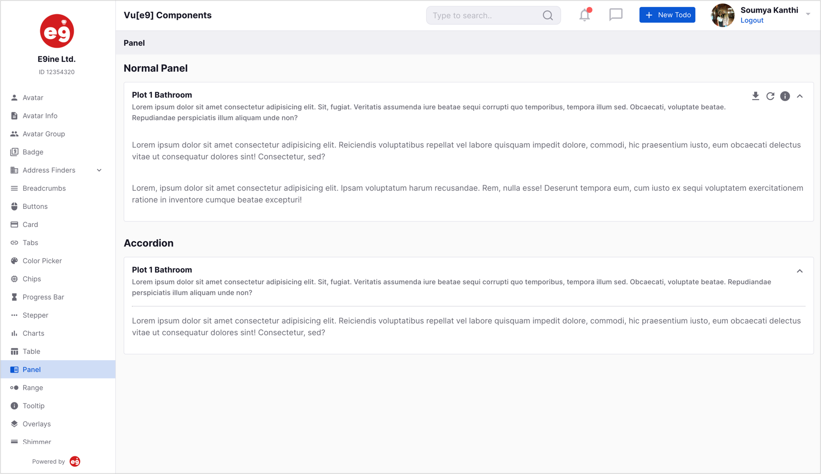
# Panel
Panels are flexible view containers with collapsible content sections. Our panels are shipped with few built in configurable options.
Properties
| Property | Type | Default | Required | Description |
|---|---|---|---|---|
| title | String | Title text for the panel. | ||
| sub-title | String | Sub-title text for the panel. | ||
| collapsible | Boolean | false | If the panel is collapsible. | |
| options | Object | {} | The options prop accepts an object with properties download, refresh & position. Please see below for more details to configure options using the options object. |
options
Both download & refresh properties should 've function assignments. info should be an object with message & position properties.
panelOptions: {
    info: {
        message: 'lorem ipsum',
        position: 'left'
    },
    download: () => {
        console.log('download');
    },
    refresh: () => {
        console.log('refresh');
    }
}
# Timepicker
The Timepicker component helps users to select time. Both 24 & 12 hour formats are available.
Properties
| Property | Type | Default | Required | Description |
|---|---|---|---|---|
| value | String, Date | Y | Initially selected date value. | |
| hour-step | Number | 1 | Step value for the hours spinbutton. | |
| minute-step | Number | 1 | Step value for the minutes spinbutton. | |
| show-seconds | Boolean | false | When true, shows the seconds spinbutton. | |
| second-step | Number | 1 | Step value for the seconds spinbutton. | |
| show-meridian | Boolean | true | If true forces the interface to 12 hour format. If false forces the interface into 24 hour format. |
Modifiers
value.sync: Bind a sync modifier to the value prop to obtain the value of value prop.
Events
changed
This event is emitted whenever the time is changed & it returns the modified Date object. This is useful when you would like to do something on time change.
# Charts
Build flexible interactuve charts using the Chart component. Variations include Bar, Column, Line, Pie, Stacked Bar, Stacked Column, Donut and Radial Bar chart. The component internally uses Apexcharts.
Properties
| Property | Type | Default | Required | Description |
|---|---|---|---|---|
| title | String | Text to display as a title of chart. | ||
| type | String | Y | Specify the chart type. Available options are Bar, StackedBar, Line, Pie, Donut, Column, StackedColumn, RadialBar and Area | |
| Width | Number, String | Width of the chart. Accepts Number (400) OR String (‘400px’). | ||
| Height | Number, String | 300px | Height of the chart. Accepts Number (400) OR String (‘400px’). | |
| show-table | Boolean | false | Whether to show a data table corresponding to the chart. | |
| data | Object | Y | Data object that has the chart data. Please refer the data table below more information. | |
| colors | Array | ['#1D3461', '#0069AA', '#376996', '#6290C8', '#829CBC'] | Colors for the chart’s series. When all colors of the array are used, it starts from the beginning. | |
| allowClick | Boolean | false | When true, chartItemClicked event is emitted when the user clicks a datapoint or a table row if table is present. | |
| options | Object | Configuration options for the chart. Refer Apexcharts Options Reference for the full list of the configuration options. |
data
| Property | Type | Default | Required | Description |
|---|---|---|---|---|
| categories | Array | Y | Categories are labels which are displayed on the x-axis. | |
| series | Array | Y | Accepts an array of [name, data] object for axis charts or an array of values for non-axis (pie/donut) charts. |
{
    categories: ['South Korea', 'Canada', 'United Kingdom', 'Netherlands', 'Italy', 'France', 'Japan', 'United States', 'China', 'Germany'],
    series: [{
        Name: 'Series1',
        data: [400, 430, 448, 470, 540, 580, 690, 1100, 1200, 1380]
    }]
}
Events
chartItemClicked event is emitted when the user clicks a datapoint or a table row if table is present. It returns the item clicked & the index of the clicked item.
# Table
The table component is used to display the data in the tabular format with the advanced options like pagination, api, sorts, filter, various style and css options, events etc.
Properties
| Property | Type | Default | Required | Description |
|---|---|---|---|---|
| headings | Array | This is a required property which accepts the array of objects containing headers options. To see more about the header options please refer headings. | ||
| items | Array, Function | Array of the data which will be rendered in the table's rows. For API based table this must be a function returning the promise. | ||
| on-row-click | Function | Method which gets called upon clicking a particular row. Function's first argument returns the data of the particular row. | ||
| options | Object | This property accepts the object for displaying options for export, arrange and reset. | ||
| pagination | Object | Pagination object which controls the pagination for the table's data. To see more about this please refer to pagination below. | ||
| sort | Object | Sorting is controlled via this object. Default sort options can be provided through this property too. To see more about this please refer the code below. | ||
| thead-class | String | This property will set the css class for <thead>, accepts thead-primary, thead-light & thead-dark. | ||
| thead-th-class | String | This property will set the css class for <thead> tag's <th>. | ||
| table-class | String | This property will set the css class for <table>, accepts table-medium, table-large, table-striped, table-hover & table-bordered. | ||
| tbody-tr-class | String | This property will set the css class for <tbody> tag's <tr>. | ||
| tbody-td-class | String,Function | This property will set the css class for <tbody> tag's <td>. This can be either a function returning a string value or normal string value. | ||
| responsive | Attribute | This attribute makes table responsive. | ||
| border-spacing | Number | Value to this adds margin between the rows. | ||
| min-width | Number | 900px | Minimum width of the table. | |
| is-expandable | Boolean | false | If each row within the table is expandable. |
headings
| Property | Type | Default | Required | Description |
|---|---|---|---|---|
| key | String | This is a required property which will be the original key of the object. | ||
| label | String | This property displays as the name of the header. | ||
| css | Function | Method must return a value which will be applied to all the <td> tags of the tbody. This is especially useful when a row needs to be coloured based on status. | ||
| sortable | Boolean | false | This property will set the column as sortable if true. Ascending and Descending icons will be visible when this property is set to true. | |
| formatter | Function | Passed method will execute and display the value in the cell after formatting. |
{
    'key': 'Environment',
    'label': 'Env',
    class: (data) => {
        return data.Environment;
    },
    formatter: (data) => {
        return data.toUpperCase();
    }
}
pagination
| Property | Type | Default | Required | Description |
|---|---|---|---|---|
| per-page | Number | This property determines how many items should be present at a time in a page. | ||
| totalItems | Number | This property determines how many total items are available for the selected criteria through-out all the pages. | ||
| currentPage | Number | This property links the table with the current page. This value gets changed when a page is changed. | ||
| threshold | Number | 2 | Threshold limits the number of pages to be shown at a time in the page numbers. By default it is set to 2 and pagination list shows neighbouring pages of current page. | |
| showJumpToFirst | Boolean | false | Setting it as true will show the list to jump to very first page. | |
| showJumpToLast | Boolean | false | Setting it as true will show the list to jump to very last page. |
options
| Property | Type | Default | Required | Description |
|---|---|---|---|---|
| export | Boolean | false | This option enables the user to export all the rows as CSV. | |
| arrange | Boolean | false | This option enables the user to rearrange the columns. Columns can be shown/hidden based on need. | |
| reset | Boolean | false | This option lets user reset the table to the original. |
Scoped Slots
Custom rendering for each data field in a row is possible using scoped slots.
Scoped field slots give you greater control over how the record data appears. You can use scoped slots to provided custom rendering for a particular field. If you want to add an extra field which does not exist in the records, just add it to the fields array, and then reference the field(s) in the scoped slot(s). Scoped field slots use the following naming syntax: v-slot:column_name="data".
You can use the default fall-back scoped slot to format any cells that do not have an explicit scoped slot provided. In scoped slot, the whole row data will be returned.
<template v-slot:OS="data">
    <div class="logo" :style="{'background-image': 'url(' + getImageUrl(data) + ')'}"></div>
</template>
scoped slots can also be used to show expanded area for a row. This is possible only when is-expanded prop is set to true. The slot exposes the row data & index via slot props.
<template v-slot:expanded-area="data">
    <div class="result">
        <pre>{{ data.data.row.result }}</pre>
    </div>
</template>
Events
expanded event is emitted whenever the expand button is clicked. The row data & index are emitted along with this event.
# Normal Table (without API)
Normal Table accepts an array of headings and items and iterates over each of them and displays as rows.
# API Table
As mentioned under the items prop, it is possible to use a function to provide the row data (items), by specifying a function reference via the items prop.
The provider function is called with the following signature returning the promise:
provider(vm) {
    return new Promise(async (resolve, reject) => {
        try {
            let result = await axios.post(`https://localhost:8081/api/search?page=${vm.pagination.currentPage}&size=${vm.pagination.perPage}&sortby=${vm.sort.value === 'desc' ? '-': ''}${vm.sort.name}`, this.filters);
            this.pagination.totalItems = result.data.count;
            resolve(result.data.data);
        } catch (err) {
            return reject(err);
        }
    });
}
provider function will receive the context as its argument which contains following structure
{
    "pagination": {},
    "sort": {},
    "filters": {}
}
TIP
filters object is just passed in order to make table component aware of any changes within filter object.
Usage
Below is the full example for an API based table component.
<Table
    :items="provider"
    :headings="columns"
    :on-row-click="rowClicked"
    :pagination.sync="pagination"
    :sort.sync="sort"
    :filters="filters"
    table-class="tr-split"
    :tbody-td-class="tbodyTdClass"
    :options="tableOptions"
>
    <template v-slot:OS="data">
        <div class="logo" :style="{'background-image': 'url(' + getImageUrl(data) +')'}"></div>
    </template>
</Table>

<script>
export default {
    data() {
        return {
            columns: [
                {
                    key: 'Hostname'
                },
                {
                    key: 'OS'
                },
                {
                    key: 'IPAddress'
                },
                {
                    key: 'LifeCycleStatus',
                    label: 'Status',
                    sortable: true
                },
                {
                    key: 'Environment',
                    class: (data) => {
                        return data.Environment;
                    },
                    formatter: (data) => {
                        return data.toUpperCase();
                    }
                },
                {
                    key: 'Network'
                }
            ],
            sort: {
                name: 'LifeCycleStatus',
                value: 'asc'
            },
            pagination: {
                perPage: 10,
                totalItems: 0,
                currentPage: 1,
                threshold: 4,
                showJumpToLast: true,
                showJumpToFirst: true
            },
            tableOptions: {
                export: true,
                arrange: true,
                reset: true
            }
        };
    },
    methods: {
        getImageUrl(data) {
            return data.value.OS ? data.value.OS.Logo : '';
        },
        rowClicked(data) {
            console.log(JSON.stringify(data));
        },
        tbodyTdClass(header, row) {
            return row.LifeCycleStatus + ' pointer';
        },
        provider(vm) {
            return new Promise(async (resolve, reject) => {
                try {
                    let result = await axios.post(
                        `https://localhost:8081/api/search?page=${vm.pagination.currentPage}&size=${vm.pagination.perPage}&sortby=${vm.sort.value === 'desc' ? '-' : ''}${vm.sort.name}`,
                        this.filters
                    );
                    this.pagination.totalItems = result.data.count;
                    resolve(result.data.data);
                } catch (err) {
                    return reject(err);
                }
            });
        }
    }
};
</script>
# Sidebar
The Sidebar component is a fixed-position toggleable slide out box, which can be used for navigation, menus, etc.
Properties
| Property | Type | Default | Required | Description |
|---|---|---|---|---|
| menu | Array | Y | The array used to build the sidebar menu. Please refer to the menu array below for the full configuration options. | |
| compact | Boolean | false | If true, the sidebar is made more compact by cutting the menu item padding by half. | |
| primary | Boolean | false | When true the $brand-primary colour will be used for the sidebar background. |
menu
The menu array accepts an array of objects. Each object represents a menu section in the sidebar. The object can have an optional menuTitle property and a mandatory menuItems array. Please refer to the menuItems Array Object below for more details.
menu: [
    {
        menuTitle: 'Components',
        menuItems: [
            {
                name: 'Avatar',
                path: '/avatar',
                icon: 'person'
            },
            {
                name: 'Avatar Info',
                path: '/avatar-info',
                icon: 'description'
            },
            {
                name: 'Avatar Group',
                path: '/avatar-group',
                icon: 'people'
            },
            {
                name: 'Badge',
                path: '/badge',
                icon: 'filter_9'
            },
            {
                name: 'Address Finders',
                path: '/address-finders',
                icon: 'business',
                expanded: false,
                subItems: [
                    {
                        name: 'Google Address Finder',
                        path: '/address-finders/google-address-finder'
                    }
                ]
            }
        ]
    },
    {
        menuTitle: 'Views',
        menuItems: [
            {
                name: 'Layout',
                path: '/layout',
                icon: 'view_compact',
                expanded: false,
                subItems: [
                    {
                        name: 'Variation 1',
                        path: '/layout/variation-1'
                    },
                    {
                        name: 'Variation 2',
                        path: '/layout/variation-2'
                    }
                ]
            }
        ]
    }
];
menuItems Array Object
    {
        name: 'Address Finders',
        path: '/address-finders',
        icon:'business',
        expanded: false,
        subItems: [{
            name: 'Google Address Finder',
            path: '/address-finders/google-address-finder',

        }]
    }
Properties
| Property | Type | Default | Required | Description |
|---|---|---|---|---|
| name | String | Text for the menu item. | ||
| path | String | The path to which the user should be navigated to on clicking the menu item. | ||
| icon | String | The icon to be used for the menu item | ||
| subItems | Array | The menu items array for the sub menu. | ||
| expanded | Boolean | false | If the sub menu should be in an expanded state by default when the menu item has a nested menu. |
Slots
- sidebarTop: Use this slot to add content like company logo, company name & any other details to the top of the sidebar.
- sidebarBottom: Use this slot to add a footer to the bottom of the sidebar.
Events
toggle-sidebar event is emitted whenever a menu item is clicked. Use this event to toggle sidebar on mobile devices whenever there is a state change.
# Datepicker
The Datepicker component can be used to capture a date selection. You can select a single date, multiple dates & a date range using the component. The component internally uses the vue-flatpickr-component.
Properties
| Property | Type | Default | Required | Description |
|---|---|---|---|---|
| value | String, Date, Array | Sets the initial selected date(s). It accepts a Date string, JavaScript Date object for single dates, an Array for a range or multiple dates. | ||
| calendar-config | Object | The configuration object for the Datepicker. Please refer to flatpickr options for the full list. | ||
| select-mode | String | day | Sets the mode for the datepicker calendar. Available options are day for a single date selection, week for the whole week selection & month for the whole month selection. |
Methods
All of the flatpickr methods can be called using the datepicker component. Please refer to the flatpickr methods for all the available methods.
Events
All of the flatpickr event listeners are bound to the datepicker component. Please refer to the flatpickr events for the full list.
Modifiers
value.sync: Binding a sync modifier to the value prop and passing a variable to the prop automatically syncs the variable with value.
Slots
Use the default to slot show custom content instead of the input box. Clicking the custom content will open the calendar.
# Topbar
The Topbar may contain your page title, logo, search box, shortcuts, avatar profile, they all depend on your configuration. You can even add your own custom content to the Topbar component.
Properties
| Property | Type | Default | Required | Description |
|---|---|---|---|---|
| logo | Object | Logo to be displayed to the left of the topbar. Refer logo object below. | ||
| page-title | Object | Text to be displayed next to the logo. Refer page-title object below. | ||
| avatar-options | Object | Configuration object for the profile avatar to the right of the topbar. Refer Avatar & Avatar Info components for all the configuration options. | ||
| topbar-options | Array | Array of objects for showing the shortcuts. Refer topbar-options table below for all the configuration options. | ||
| search-options | Object | Configuration object for the search box. Refer search-options below for all the configuration options. | ||
| search-text | String | The property with which the search input value should be synced with. |
logo
logo:{
    url:'https://htmlsigs.s3.amazonaws.com/logos/files/001/087/329/landscape/e9ineLogo.png',
    mobile:true
}
page-title
pageTitle:{
    text:"Vu[e9] Components",
    align:"center",
    mobile:true
}
mobile:true can be used to control the visibility of the element on mobile devices.
topbar-options
| Property | Type | Default | Required | Description |
|---|---|---|---|---|
| icon | String | Icon to be used for the shortcut. | ||
| type | String | Whether the shortcut should be displayed as an icon or a button. Use icon for icon and btn for button. | ||
| text | String | Text to be shown on hovering the shortcut if type is icon. Will be used for button text if type is btn. | ||
| pending | Boolean | If true, a badge will be showed to the top right of the button or icon. This is usually used to indicate some pending action to be performed by the user. | ||
| click-action | Function | Function to be called on clicking the shortcut button or icon. | ||
| mobile | Boolean | false | If the shortcut should be displayed on mobile. |
search-options
| Property | Type | Default | Required | Description |
|---|---|---|---|---|
| placeholder | String | Placeholder text for the search box. | ||
| click-action | Function | Function to be called on clicking the search box. | ||
| mobile | Boolean | false | If the search box should be displayed on mobile. |
Slots
Use the default slot to insert custom content into the topbar after the logo & page title.
topbarAvatarActions: Use this slot to add custom content to avatar actions panel. This will override the avatar-actions array within avatar-options.
TIP
Passing a function to click-action prop will make the search input box readonly and will call the function passed to click-action prop.
# TabBar
The TabBar component displays a horizontal row of tabs.
Properties
| Property | Type | Default | Required | Description |
|---|---|---|---|---|
| menu | Array | Y | The array used to build the tabbar menu. Please refer to the menu array below for the full configuration options. |
menu
The menu array accepts an array of objects. Each object represents a menu item in the tabbar. The object can have an optional badgeOptions property to indicate some pending user action. Please refer to the Badge component for more details.
<template>
    <TabBar :menu="menu"></TabBar>
</template>

<script>
export default {
    name: 'TabBarExample',
    data() {
        return {
            menu: [
                {
                    name: 'Dashboard',
                    path: '/dashboard',
                    icon: 'dashboard'
                },
                {
                    name: 'Jobs',
                    path: '/jobs',
                    icon: 'assignment_turned_in',
                    badgeOptions: {
                        size: 20,
                        color: '#FC5A5A',
                        position: 'top-right',
                        text: '999'
                    }
                },
                {
                    name: 'Payments',
                    path: '/payments',
                    icon: 'post_add'
                },
                {
                    name: 'Profile',
                    path: '/profile',
                    icon: 'person_outline'
                }
            ]
        };
    }
};
</script>

# Modal
A modal is a window overlaid on either the primary window or another dialog window. Contents behind a modal dialog are inert meaning that users cannot interact with content behind the dialog.
Properties
| Property | Type | Default | Required | Description |
|---|---|---|---|---|
| v-model | Boolean | false | v-model property is automatically synced with the modal's visible state and you can show/hide using v-model. | |
| size | String | md | Modals have three optional sizes, available via the prop size. These sizes kick in at certain breakpoints to avoid horizontal scrollbars on narrower viewports. Valid optional sizes are sm, lg, md and xl. | |
| hide-footer | Boolean | false | If the default footer should be hidden when the footer slot is not added. The default footer has a OK & a Cancel button. |
Attributes
- centered: Vertically center your modal in the viewport by adding this attribute.
- primary: When present, the modal header has a brand-primary background.
Slots
- title: Use this slot to place content in the modal's title.
- header: Use this slot to place content in the header. Replaces the entire header including the close button.
- body: Use this slot to place content in the body.
- footer: Use this slot to place content in the footer.
Events
- cancel: This event is emitted when the close icon is clicked.
- save: This event is emitted when the default OK button is clicked.
TIP
If you do not want the modal's state to be persisted on close, use the v-if with the Modal component.
# Image Selector
Use the ImageSelector component to upload images from your local folders. It ships with a cropper which can be used to crop the selected image before uploading.
Properties
| Property | Type | Default | Required | Description |
|---|---|---|---|---|
| v-model | Boolean | false | v-model property is automatically synced with the modal's visible state and you can show/hide using v-model. | |
| size | String | lg | Modals have three optional sizes, available via the prop size. These sizes kick in at certain breakpoints to avoid horizontal scrollbars on narrower viewports. Valid optional sizes are sm, lg, md and xl. | |
| config | Object | {maxSize: 5, aspectRatio: 0, minWidth: null} | Configuration object for the image selector. |
Attributes
- primary: When present, the modal header has a brand-primary background.
Events
- cancel: This event is emitted when the close icon is clicked.
- close: This event is emitted when one of the upload buttons are clicked. The image object is emitted with this event.
TIP
If you do not want the selected image to be persisted on close, use the v-if with the Image Selector component.
# Rich Text
Use the RichText component to display rich text editor (Slack styled) for chat box.
Properties
| Property | Type | Default | Required | Description |
|---|---|---|---|---|
| options | Object | Y | To propogate your content, placholder and attachmentKey properties. | |
| attachments | Array | [] | Either be array of URLs or array of objects if attachmentKey is specified in options. | |
| send | Function | noop | Function to send the message. | |
| addAttachment | Function | noop | Function to add attachment. Add an item to attachments array to display image inside RichText. If it's a document, handle it by passing a placeholder image to attachments at needed index. | |
| remoteAttachment | Function | noop | Function to remove attachment. Signature: (index, item) | |
| previewAttachment | Function | noop | Function to preview attachment. Signature: (index, item) |
options:
| Property | Type | Default | Required | Description |
|---|---|---|---|---|
| content | String | Y | State for the text is controlled by this property. This will change in real time when user types something into rich text. | |
| placeholder | String | Start typing... | State for the text is controlled by this property. This is reactive and will change in real time when user types something into rich text. | |
| attachmentKey | String | Key which is responsible for image if it's an array of objects for images. Don't use this property if you have documents - use attachments with strings for placeholder images. |
TIP
To remove the content of the editor after message is sent, declare a ref on RichText and use below method expose by component. Make sure to use it with this.$nextTick.
this.$nextTick(() => {
    this.$refs.richTextEditor.clearContent();
});