![Vu[e9] Components](https://htmlsigs.s3.amazonaws.com/logos/files/001/087/329/landscape/e9ineLogo.png)
# Views
# Login
The Login views allows users to setup a login page instantly. There are a few variations available, the usage of which is explained below.
# Variation 1
The Variation 1 creates a simple, responsive login page layout with a left and right div. The view features a hero image as well.
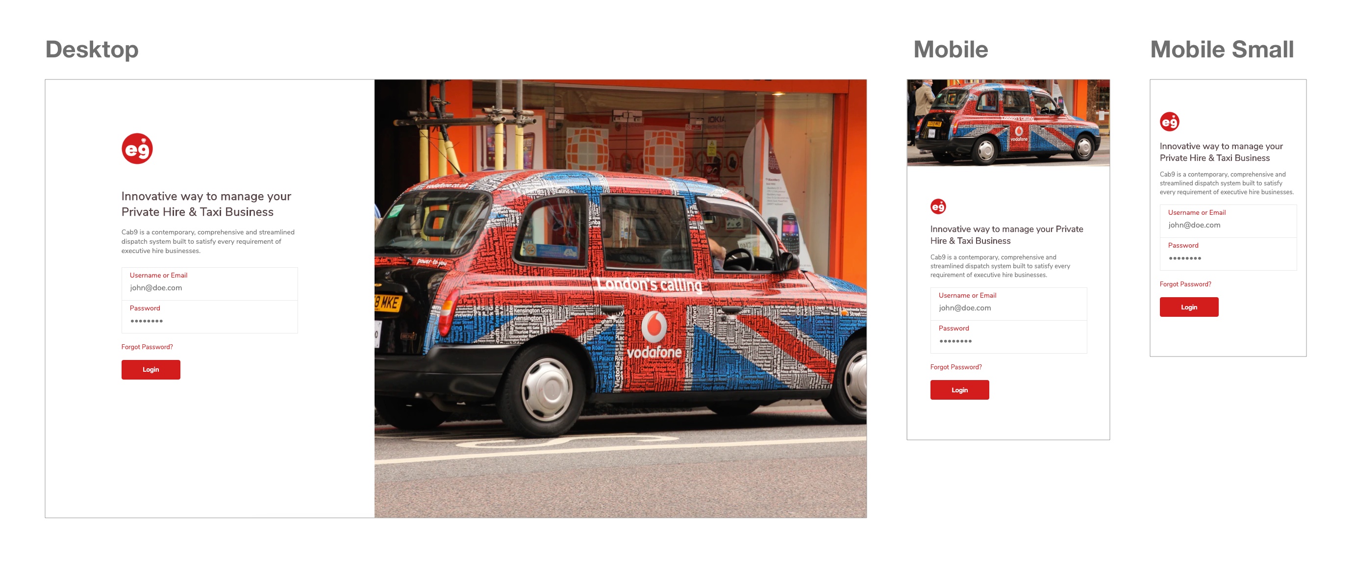 A list of customisable properties are below:
| Property | Type | Description |
|---|---|---|
| brand-primary | String | The default accent colour. Default #000000. |
| title-text | String | The title text for the page. |
| sub-title-text | String | The subtitle text for the page. |
| text-dark-color | String | The dark text colour of the page. This colour is also used for the title. |
| text-light-color | String | The light text colour of the page. This colour is also used for the sub title. |
| background-image | String | The background image for the page. |
| :on-click-fn | Function | The OnClick function override. |
TIP
The login parameters are username and password.
Code
<template>
<LoginVariation1
brand-primary="#d21d1d"
brand-logo-url="https://cab9.app/includes/images/logo.png"
title-text="Innovative way to manage your Private Hire & Taxi Business"
sub-title-text="Cab9 is a contemporary, comprehensive and streamlined dispatch system built to satisfy every requirement of executive hire businesses."
text-dark="#e90000"
text-light="#9e9e9e"
background-image="https://images.unsplash.com/photo-1526527736852-326fd1380c1b?ixlib=rb-1.2.1&ixid=eyJhcHBfaWQiOjEyMDd9&auto=format&fit=crop&w=1350&q=80"
:on-click-fn="loginButtonClicked">
</LoginVariation1>
</template>
<script>
import {LoginVariation1} from '@e9ine/vue_components';
export default {
name: 'Login',
components: {
LoginVariation1
},
methods: {
loginButtonClicked(username, password) {
console.info(`Username is :${username}`);
console.info(`Password is :${password}`);
}
}
};
</script>
# Layouts
The Layouts views allows users to setup the page layouts for a project instantly. There are a few variations available, the usage of which is explained below.
# Variation-1
The Variation 1 creates a simple, responsive page layout with a sidebar on the left, a topbar, an optional breadcrumbs bar, all of which are configurable using slots. The content area has a <router-view> that renders the matched component for the given path.
# Slots
sidebar: Use the sidebar slot to add a sidebar to the layout. You can use the Sidebar component inside the slot or add your own custom content.
topbar: Use the topbar slot to add a topbar to the layout. You can use the Topbar component inside the slot or add your own custom content.
breadcrumbs: Use the breadcrumbs slot to add breadcrumbs to the layout for easier navigation. You can use the Breadcrumbs component inside the slot or add your own custom content.
A list of customisable properties are below:
| Property | Type | Description |
|---|---|---|
| router-view-key | String | Pass a dynamic key to hot reload data within the router-view. |
Code
<template>
    <div class="app">
        <LayoutVariation1 :show-back-btn="true">
            <template v-slot:sidebar>
                <SideBar :compact="true" :primary="false" :menu="menu">
                    <template v-slot:sidebarTop>
                        <div class="logo-wrapper">
                            <img src="https://htmlsigs.s3.amazonaws.com/logos/files/001/087/329/landscape/e9ineLogo.png" alt="">
                        </div>
                        <h6>E9ine Ltd.</h6>
                        <p>ID 12354320</p>
                    </template>
                    <template v-slot:sidebarBottom>
                        <div class="footer-wrapper">
                            <span>Powered by</span> <img src="https://htmlsigs.s3.amazonaws.com/logos/files/001/087/329/landscape/e9ineLogo.png" alt="">
                        </div>
                    </template>
                </SideBar>
            </template>
            <template v-slot:topbar>
                <TopBar :topbar-options="topbarOptions" :avatar-options="avatarOptions" :search-options="searchOptions" :search-text.sync="searchText" :page-title="pageTitle" :logo="logo"></TopBar>
            </template>
            <template v-slot:breadcrumbs>
                <Breadcrumbs></Breadcrumbs>
            </template>
        </LayoutVariation1>
    </div>
</template>

<script>
import {LayoutVariation1,SideBar,TopBar,Breadcrumbs,Tabbar} from '@/e9ine/vue_components';


export default {
    components: {
        LayoutVariation1,
        SideBar,
        TopBar,
        TabBar,
        Breadcrumbs
    },
    data() {
        return {
            menu:this.$store.state.sideBarModule.menu,
            tabBarMenu:this.$store.state.navModule.menuItems,
            searchText:'',
            searchOptions:{
                placeholder:'Type to search..',
                clickAction:function () {
                    console.log('search clicked');
                },
                mobile:false
            },
            logo:{
                url:'https://htmlsigs.s3.amazonaws.com/logos/files/001/087/329/landscape/e9ineLogo.png',
                mobile:true
            },
            pageTitle:{
                text:'Vu[e9] Components',
                align:'left',
                mobile:false
            },
            avatarOptions:{
                title:'Soumya Kanthi',
                subtitle:'Logout',
                imageUrl:'https://66.media.tumblr.com/3f6c3a89a576a4a09a2ea18c5f2d5da9/tumblr_pk0lqkbqM31ss2e34o1_1280.jpg',
                size:36,
                subtitleOptions: {
                    clickAction:function () {
                        console.log('logout');
                    },
                },
                avatarActions: [{
                    name: 'Account',
                    href: 'https://www.google.com',
                }, {
                    name: 'Navigate',
                    href: 'https://www.yahoo.com',
                }]
            },
            topbarOptions:[{
                icon:'notifications_none',
                text:'Notifications',
                type:'icon',
                pending:true,
                clickAction:function () {
                    console.log('notifications');
                },
                mobile:false
            },{
                icon:'chat_bubble_outline',
                text:'Messages',
                type:'icon',
                clickAction:function () {
                    console.log('messages');
                },
                mobile:false
            },
            {
                text:'New Todo',
                type:'btn',
                btnClass:'primary',
                icon:'add_circle_outline',
                clickAction:function () {
                    console.log('new todo');
                },
                mobile:false
            }]
        };
    },
    methods: {
        logoutUser() {
            console.log('logout');
        },
    },
    watch: {
        searchText(newVal, oldVal) {
            console.log(oldVal+':'+newVal);
        }
    }
};
</script>

<style lang="scss">
.app {
    .sidebar {
        .sidebar-top {
            text-align: center;
            padding: 24px;

            .logo-wrapper {
                width: 80px;
                margin: 0 auto;
            }

            h6 {
                margin-top: 0.5rem;
                margin-bottom: 0.5rem;
            }

            p {
                font-size: 0.75rem;
                margin-bottom: 0;
            }
        }

        .sidebar-bottom {
            .footer-wrapper {
                padding: 1rem;
                font-size: 0.75rem;
                display: flex;
                justify-content: center;
                align-items: center;

                img {
                    width: 25px;
                    margin-left: 0.5rem;
                }
            }
        }

        &-primary {
            .sidebar-top {
                h6 {
                    color: $white;
                }

                p {
                    color: $light;

                }
            }

            .sidebar-bottom {
                .footer-wrapper {
                    color: $white;
                }
            }
        }
    }
}
</style>
TIP
Control the sidebar & topbar heights using the Sass variables $sidebar-width & $topbar-height so that the whole layout gets auto adjusted for the changed values.
# Variation-2
The Variation 2 creates a simple, responsive page layout with an a topbar, optional sidebar on the right, an optional breadcrumbs bar amd a tabbar at the bottoom all of which are configurable using slots. The content area has a <router-view> that renders the matched component for the given path.
# Slots
sidebar: Use the sidebar slot to add a sidebar to the layout. You can use the Sidebar component inside the slot or add your own custom content.
topbar: Use the topbar slot to add a topbar to the layout. You can use the Topbar component inside the slot or add your own custom content.
breadcrumbs: Use the breadcrumbs slot to add breadcrumbs to the layout for easier navigation. You can use the Breadcrumbs component inside the slot or add your own custom content.
tabbar: Use the tabbar slot to add a tabbar to the layout for quick navigation. You can use the Tabbar component inside the slot or add your own custom content.
Code
<template>
    <div class="app">
        <LayoutVariation2 :show-back-btn="true">
            <template v-slot:sidebar>
                <SideBar :compact="true" :primary="false" :menu="menu">
                    <template v-slot:sidebarTop>
                        <div class="logo-wrapper">
                            <img src="https://htmlsigs.s3.amazonaws.com/logos/files/001/087/329/landscape/e9ineLogo.png" alt="">
                        </div>
                        <h6>E9ine Ltd.</h6>
                        <p>ID 12354320</p>
                    </template>
                    <template v-slot:sidebarBottom>
                        <div class="footer-wrapper">
                            <span>Powered by</span> <img src="https://htmlsigs.s3.amazonaws.com/logos/files/001/087/329/landscape/e9ineLogo.png" alt="">
                        </div>
                    </template>
                </SideBar>
            </template>
            <template v-slot:topbar>
                <TopBar :page-title="pageTitle"></TopBar>
            </template>
            <template v-slot:breadcrumbs>
                <Breadcrumbs></Breadcrumbs>
            </template>
            <template v-slot:tabbar>
                <TabBar :menu="tabBarMenu"></TabBar>
            </template>
        </LayoutVariation2>
    </div>
</template>

<script>
import {LayoutVariation2,SideBar,TopBar,Breadcrumbs,Tabbar} from '@/e9ine/vue_components';

export default {
    components: {
        LayoutVariation2,
        SideBar,
        TopBar,
        Breadcrumbs,
        TabBar
    },
    data() {
        return {
            menu:this.$store.state.sideBarModule.menu,
            tabBarMenu:this.$store.state.navModule.menuItems,
            pageTitle:{
                text:'Vu[e9] Components',
                align:'center',
                mobile:true
            }
        };
    }
};
</script>

<style lang="scss">
.app {
    .sidebar {
        .sidebar-top {
            text-align: center;
            padding: 24px;

            .logo-wrapper {
                width: 80px;
                margin: 0 auto;
            }

            h6 {
                margin-top: 0.5rem;
                margin-bottom: 0.5rem;
            }

            p {
                font-size: 0.75rem;
                margin-bottom: 0;
            }
        }

        .sidebar-bottom {
            .footer-wrapper {
                padding: 1rem;
                font-size: 0.75rem;
                display: flex;
                justify-content: center;
                align-items: center;

                img {
                    width: 25px;
                    margin-left: 0.5rem;
                }
            }
        }

        &-primary {
            .sidebar-top {
                h6 {
                    color: $white;
                }

                p {
                    color: $light;

                }
            }
            .sidebar-bottom {
                .footer-wrapper {
                    color: $white;
                }
            }
        }
    }
}
</style>
# Variation-3
The Variation 3 creates a simple, responsive page layout with a topbar and a tabbar at the bottom with a More option that opens up an offscreen menu all of which are configurable using slots. The content area has a <router-view> that renders the matched component for the given path.
Properties
| Property | Type | Default | Required | Description |
|---|---|---|---|---|
| showBackBtn | Boolean | false | If a back button should be displayed for inner states. | |
| topbarLeftOptions | Array | Array of objects for showing the shortcuts on the left within the topbar. Refer topbar-options table below for all the configuration options. | ||
| topbarRightOptions | Array | Array of objects for showing the shortcuts on the right within the topbar. Refer topbar-options table below for all the configuration options. | ||
| searchOptions | Object | Configuration object for the search box. Refer search-options below for all the configuration options. | ||
| searchText | String | The property with which the search input value should be synced with. |
topbar-options
| Property | Type | Default | Required | Description |
|---|---|---|---|---|
| icon | String | Icon to be used for the shortcut. | ||
| type | String | Whether the shortcut should be displayed as an icon or a button. Use icon for icon and btn for button. | ||
| text | String | Text to be shown on hovering the shortcut if type is icon. Will be used for button text if type is btn. | ||
| pending | Boolean | If true, a badge will be showed to the top right of the button or icon. This is usually used to indicate some pending action to be performed by the user. | ||
| click-action | Function | Function to be called on clicking the shortcut button or icon. |
search-options
| Property | Type | Default | Required | Description |
|---|---|---|---|---|
| placeholder | String | Placeholder text for the search box. | ||
| click-action | Function | Function to be called on clicking the search box. |
Slots
topbar: Use the topbar slot to add a custom topbar to the layout. If empty it uses the default topbar.
tabbar: Use the tabbar slot to add a tabbar to the layout for quick navigation. You can use the Tabbar component inside the slot or add your own custom content.
Code
<template>
    <div class="app">
        <LayoutVariation3 :show-back-btn="true" :topbar-left-options="topbarLeftOptions" :topbar-right-options="topbarRightOptions" :search-options="searchOptions" :search-text.sync="searchText">
            <template v-slot:tabbar>
                <TabBar :menu="tabBarMenu"></TabBar>
            </template>
        </LayoutVariation3>
    </div>
</template>

<script>
import {LayoutVariation3,Tabbar} from '@/e9ine/vue_components';
export default {
    components: {
        LayoutVariation3,
        TabBar,
    },
    data() {
        return {
            tabBarMenu: this.$store.state.navModule.menuItems,
            searchText: '',
            searchOptions: {
                placeholder: 'Type to search..'
            },
            topbarLeftOptions: [{
                text: 'Edit',
                clickAction: function() {
                    console.log('notifications');
                },
            }],
            topbarRightOptions: [
                {
                    icon: 'notifications_none',
                    text: 'Notifications',
                    type: 'icon',
                    pending: true,
                    clickAction: function() {
                        console.log('edit');
                    },
                },
                {
                    icon: 'chat_bubble_outline',
                    text: 'Messages',
                    type: 'icon',
                    href:'https://www.google.com'
                }
            ]
        };
    },
    methods: {
        logoutUser() {
            console.log('logout');
        }
    },
    watch: {
        searchText(newVal, oldVal) {
            console.log(oldVal + ':' + newVal);
        }
    }
};
</script>